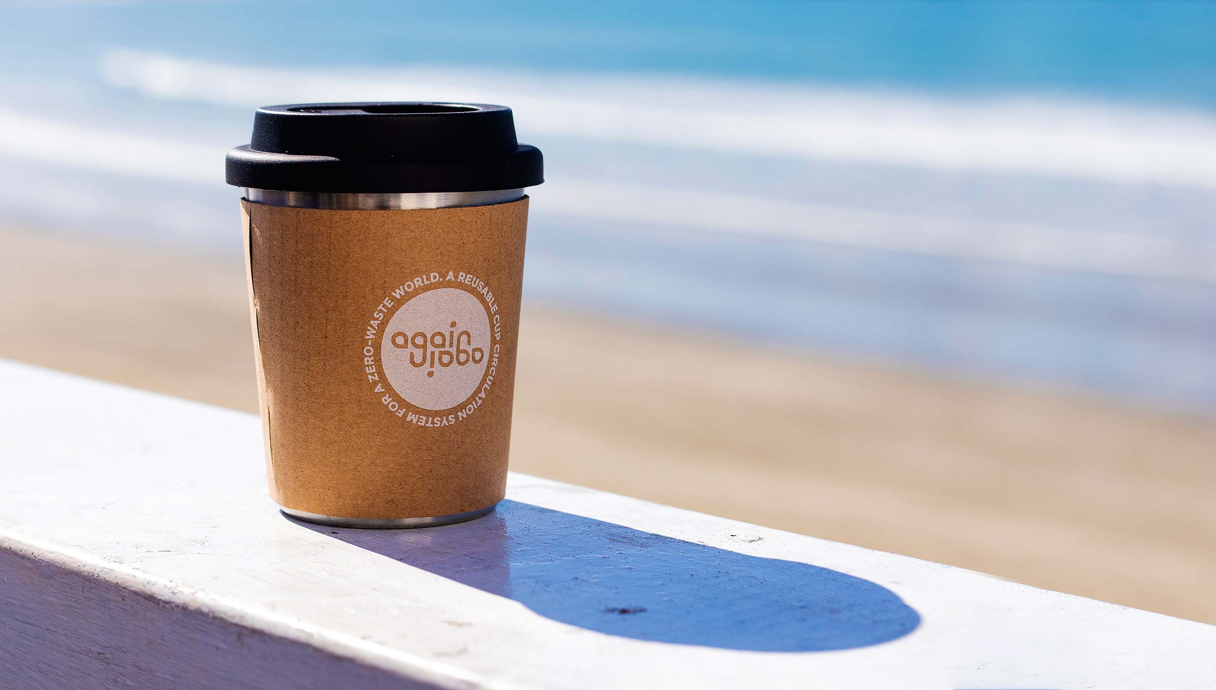
Again Again Branding
Brand identity design, illustration
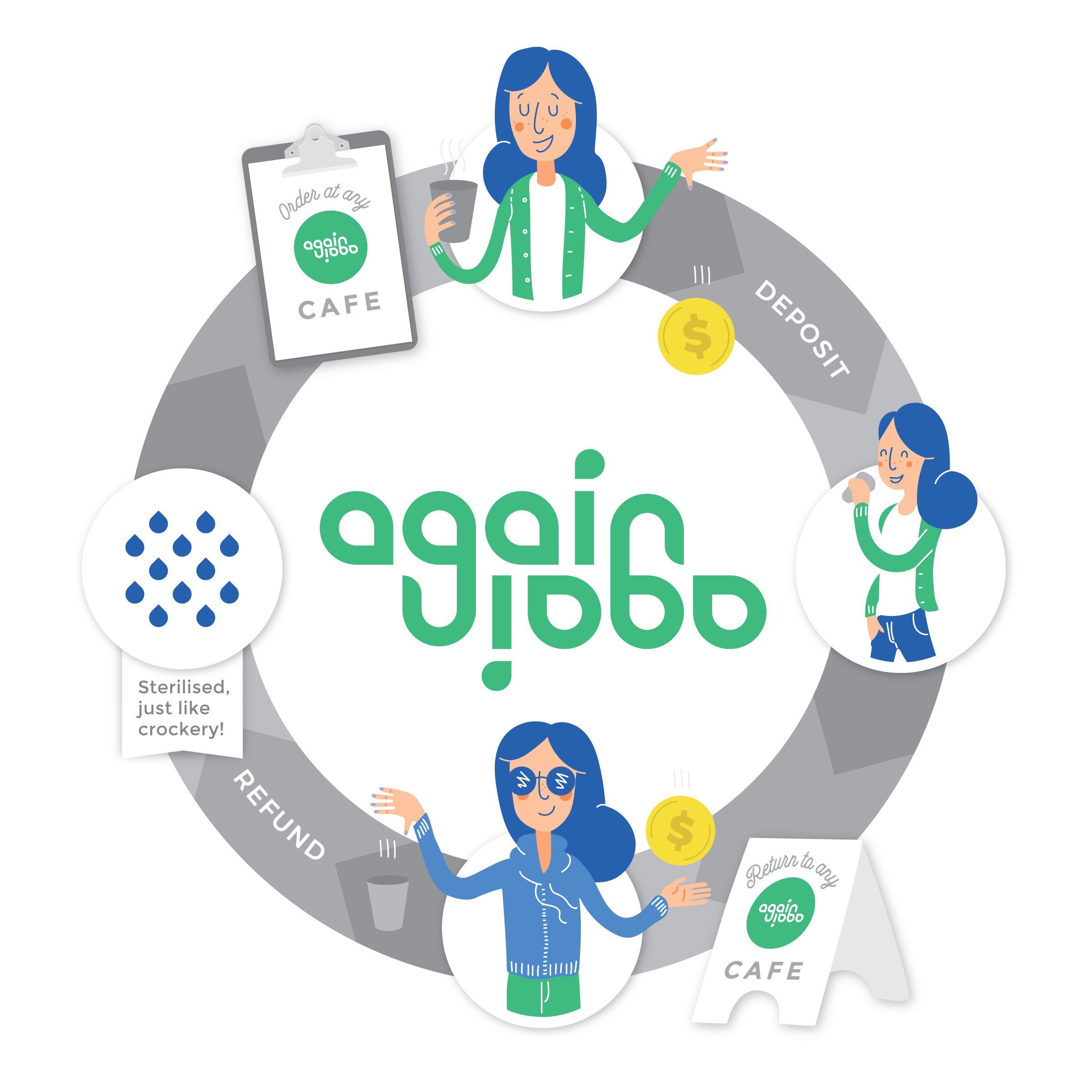
Again Again set out to change the culture of takeaway coffee by creating a circular reusable cup system, making borrowing, returning, and reusing cups as convenient as using a disposable one. Their innovative “cup library” model connected cafés and customers through a shared network of reusable cups, helping remove one of the biggest barriers to sustainable behaviour: convenience.
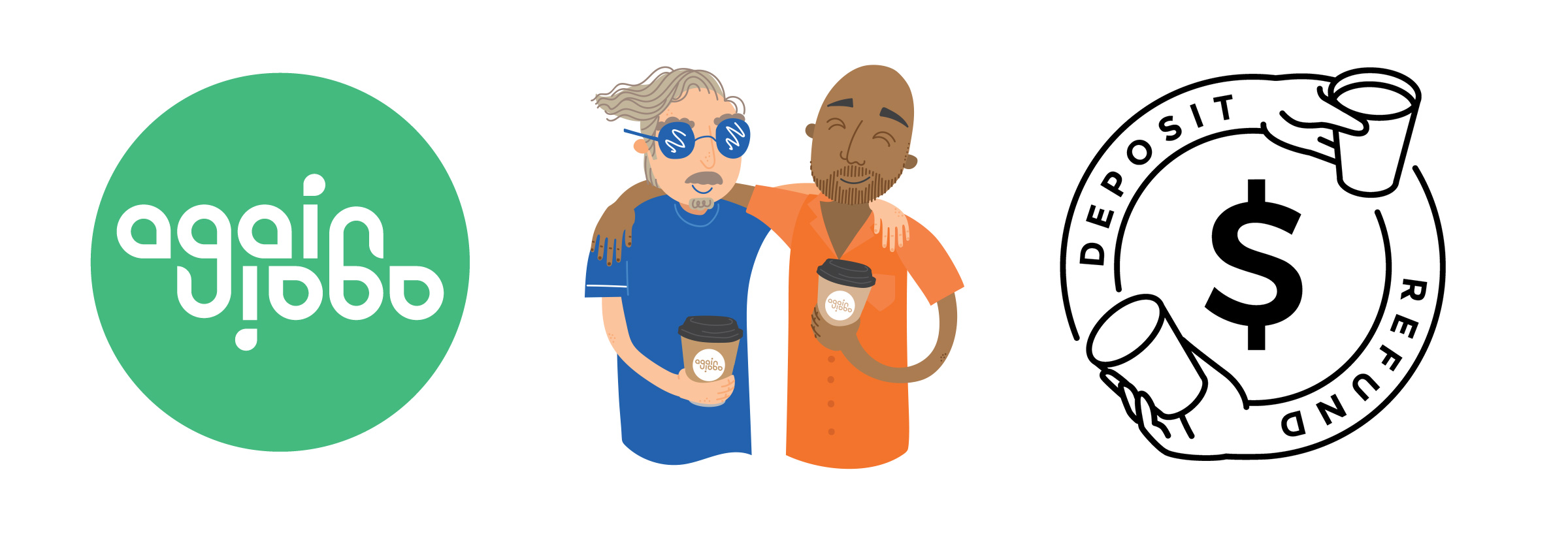
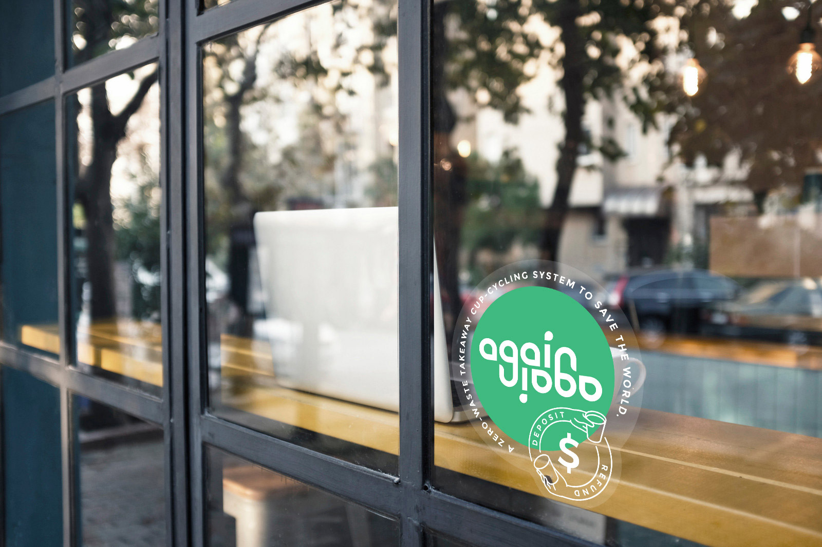
The logo was designed around the idea of repetition and circularity. A rotational ambigram, the mark appears identical when viewed upside down or right-side up — a playful but functional solution that was perfectly suited to takeaway cups stacked on top of a coffee machine.
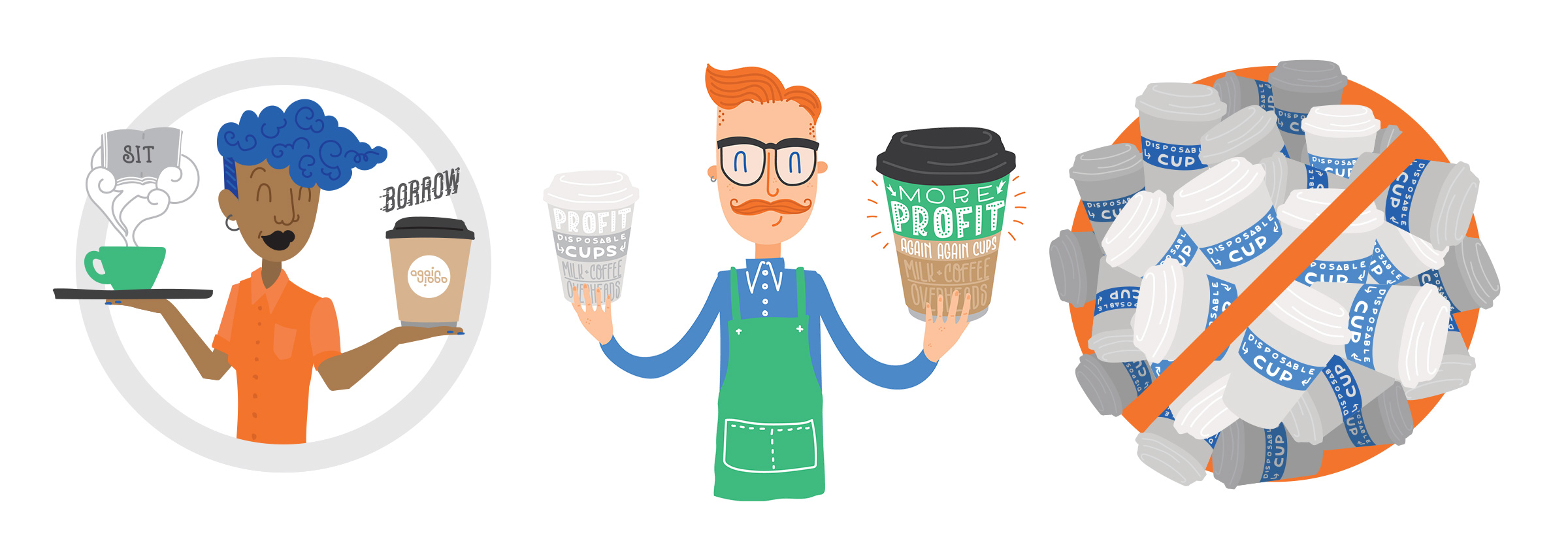
Beyond the logo, we developed illustrations and supporting visuals that helped communicate Again Again’s optimistic approach to waste reduction and behaviour change.
Again Again was a reminder that meaningful change requires more than good intentions. It requires systems that support better choices — and sometimes, legislation and infrastructure need to shift before behaviour can truly follow.